Though I would shy away from using such saturated colors in my own home, the 1st and 3rd images are really beautiful...both have an amazing harmony despite presence of varied colors.
I love all the saturated color, especially the blue dresser and that coral colored chair with the pom-pons on it! I'm so glad to find your blog and can't wait to meet you at the Design Blogger Conference in L.A. next week! Please say hi! Stacy

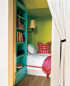


Though I would shy away from using such saturated colors in my own home, the 1st and 3rd images are really beautiful...both have an amazing harmony despite presence of varied colors.
ReplyDeleteThese images are extremely strong powerful statements of the intracity of play of colors. Not for the inexperienced designer...
ReplyDeleteI love all the saturated color, especially the blue dresser and that coral colored chair with the pom-pons on it! I'm so glad to find your blog and can't wait to meet you at the Design Blogger Conference in L.A. next week! Please say hi! Stacy
ReplyDeletegreat quote and even better images!
ReplyDeletetrue statement. these rooms are all so vibrant and beautiful!
ReplyDeletehttp://www.wordbyjessie.com
http://www.bloglovin.com/en/blog/2039498/word-by-jessie
xxjj
The differences in colors between the photos is great! Love the blue doors!
ReplyDeleteThanks always enjoy your blog
Jamie Herzlinger